GENERAL NOTES ON ANALYSIS PROCEDURES:
DATA BLOCKS: If
no data block is selected, only the RUNNING AVERAGE, PAIRS DIFFERENCES,
and FFT (Fast Fourier Transform) analyses are available (and except for FFT, only in Active
Screen mode). For all other analyses a data block must
be selected.
Once you have performed
an analysis operation and want to select a new data block, click the 'Exit'
or 'Cancel' button in the RESULTS window (or that window's
close button). The cursor will become a
crosshair when within the plot area.

This example of a block window shows the upper and lower limits of the
data within the block. This particular block (being analyzed with
the Integrate option) also shows:
- left and right limits (indicated by the shaded areas)
- a proportional baseline between the start and end points (left and
right limits)
- the channel label (at bottom left)
MORE BLOCK HANDLING AND ANALYSIS TOOLS:
When activated, the AUTOREPEAT
option will repeat the most recently used analysis whenever you select a
new data block. This simplifies doing the same analysis on a series
of different blocks, but it can be annoying if you wish to perform different
analyses. If autorepeat is on and you want to do something else, pick
the new operation from the ANALYZE menu or from the 'toolbar' buttons
at the bottom of the plot area.
At the bottom of most ANALYZE operation windows,
the 'Print Window Image' button will send a copy of the window content to the printer or an image file (pdf, png, etc):
 Scaling factors may be applied to
results for several ANALYZE operations with the 'scale' button (see
below).
The 'Store' button in many
of the analysis mode windows allows you to directly transfer the current
results mean for use as a scaling factor. When you click the 'Store'
button, the scaling factors window appears. Click on any channel's
' * ' or ' ÷ ' button, and the current mean will appear.
The 'help' button opens the
LabAnalyst help
window to the section for the ongoing analysis operation -- i.e., if you
click 'help' from BASIC STATS, the help window opens to the basic
stats instructions.
If the analysis operation you are using offers channel selection buttons, you can see the channel labels if you 'float' the cursor over the channel buttons*. In addition, if you select the 'Show Channel Labels Windows' option in Preferences (LabAnalyst menu), a window will open near the bottom of the screen, showing a list of all the channels in the file. Note that this window may not appear until you change channels or redraw the plot window.
Scaling factors may be applied to
results for several ANALYZE operations with the 'scale' button (see
below).
The 'Store' button in many
of the analysis mode windows allows you to directly transfer the current
results mean for use as a scaling factor. When you click the 'Store'
button, the scaling factors window appears. Click on any channel's
' * ' or ' ÷ ' button, and the current mean will appear.
The 'help' button opens the
LabAnalyst help
window to the section for the ongoing analysis operation -- i.e., if you
click 'help' from BASIC STATS, the help window opens to the basic
stats instructions.
If the analysis operation you are using offers channel selection buttons, you can see the channel labels if you 'float' the cursor over the channel buttons*. In addition, if you select the 'Show Channel Labels Windows' option in Preferences (LabAnalyst menu), a window will open near the bottom of the screen, showing a list of all the channels in the file. Note that this window may not appear until you change channels or redraw the plot window.
* If you want to adjust the font size or the time delay for the 'Tool Tips' windows that show channel labels, and you feel comfortable entering text commands directly into MacOS, activate Terminal (Utilities folder, in Applications). Then:
To change font size to 14 points (or any value you like), type this (followed by RETURN):
defaults write -g NSToolTipsFontSize -int 14
To change the activation delay to 20 ms (or any value you like), type this (followed by RETURN):
defaults write -g NSInitialToolTipDelay -int 20
PRINTING RESULTS (text output):
Many analysis operations (and some other data manipulations) let you save results to a text file. You can usually chose between two formats:
 
Comma-separated variables (.csv). This is a standard format for text files and is easily opened and read by many editing programs. If you have Microsoft Excel (or Office) on your computer, these files generally show as this icon or something similar, depending on what software you have installed. If these files are double-clicked, Excel will open them automatically.

Tab-separated text (ASCII) variables, which are saved with a suffix (.xls) that should make them open in Microsoft Excel if they are double-clicked or dragged. NOTE: these are NOT in standard .xls format, which is a proprietary binary format that isn't created by LabAnalyst. When Excel tries to open one of these files, it may give you a warning that the format is incorrect and ask if you want to load it anyway. It should be fine to do so -- Excel quickly figures out that it's a text file and opens it correctly.
back to top
If no data block is selected
you can perform the following two operations (as well as Fast
Fourier transforms):
RUNNING AVERAGE...
⌘5 Lets you click on a series of SINGLE points
while LabAnalyst keeps track of the
cumulative mean, standard deviation (SD), coefficient of variation (CV),
and standard error (SE). The program also shows the summed total of
all selected points, and the range (minimum and maximum values).
To select points for analysis, move the cursor to the point of interest
in the plot area and click once. Then move to the next point and repeat.
- You can eliminate a single mistake (the last point indicated
with a mouse click) with the delete key.
- To exit the routine, move the cursor to the RESULTS window and click
the mouse once (the cursor can be anywhere in the result window).
PAIRS DIFFERENCE... ⌘6 Calculates
the cumulative mean, SD, and SE of a series of PAIRS of points. You
select point pairs with mouse clicks (an example might be the peaks and
valleys of a ventilation trace). LabAnalyst measures the absolute difference between the points in the
pair. It also calculates the cumulative mean, SD, and SE of the time
intervals between points. As for RUNNING AVERAGE, the delete
key gets rid of the last pair of points selected.

NOTE: this operation DOES NOT highlight the results window title when
active, as can be seen in the example above.
back to top
If a data block HAS been selected,
you can perform the following operations:
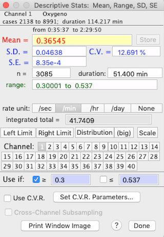
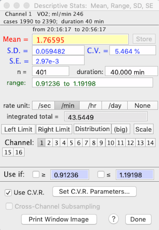
BASIC STATS
⌘B Computes descriptive statistics, including the mean, range, standard
deviation (SD), standard error (SE), and coefficient of variation (CV) of
the block (it also shows the time duration and the data range).
To get the integrated total for a rate function, such as oxygen consumption,
make sure the correct rate unit is selected (i.e., 'per min' if the
units are ml/min or 'per hour' if the units are ml/hour). A more sophisticated
integration mode is available in the INTEGRATE
BLOCK option.
Use the 'limits' buttons to restrict analysis to a subsection
of the block. Click the right or left limit button, then use the cursor to select the limits in the block window.
See the notes on MINIMUM, MAXIMUM, LEVEL below for information on the 'C.V.R.' buttons.
The 'scale' button toggles scaling of the results (see SCALE RESULTS, below). The 'Store'
button in this and other analysis mode windows allows you to directly transfer
the current mean for use as a scaling factor. When you click 'Store',
the scaling factors window appears. Click on any channel's "*"
or "÷" button, and the current mean will appear in the
first edit field (the multiplication or division factor) for that channel.
The 'select,' '≥' and '≤' buttons at the bottom of the window let you get basic statistics for a subset of the block, within the defined numeric limits. Note that there must be at least 3 data points within the subset limits, or the program will issue a warning buzz, turn off the '≥' and '≤' buttons, and default to the previous basic statistics results.
If you restrict analysis to a subset of data, or use cross-channel subsets, a warning window will appear for analyses that 'pay attention' to subset settings. This example shows cross-channel selection is being used, and within the channel being analyzed, data with values less than 0.5 or greater than 21.12 are ignored.
The 'distribution' button produces a small histogram (bar graph) of frequency distribution in a small moveable window. You can use the '(big)' button to produce a much larger and more detailed histogram, with control over the number of bins and bin width (see below). If the file has more than one channel, you can click on buttons for different channels and get those means (you can also use the keyboard to select channels). With an option in the PREFERENCES menu, you can have different histogram windows for each channel, or use the same small window for all channels.

You can also draw a histogram of a selected block with the DISTRIBUTION HISTOGRAM (⌘H) option in the ANALYZE menu. This method draws a histogram for the current active channel (displayed on the plot window), with no options for subsets, limits, or cross-channel indexing. It will not change if you select a new active channel, or new data file (select the DISTRIBUTION HISTOGRAM menu option again to update).
back to top
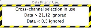
MINIMUM VALUE...
⌘M
MAXIMUM VALUE...
⌘U
MOST LEVEL...
⌘9
MOST VARIABLE...
Allow you to enter an interval (in seconds) and LabAnalyst will search within the selected block for either the highest
or lowest continuous average over that interval, or the most level
or most variable region within the block.
• NOTE: scanning large data blocks, especially for large scan intervals, can be time-consuming. The program will post a warning message when it thinks calculation times will be lengthy.
 Activating the 'reuse this interval' button
in the interval selection window will bypass the interval selection routine
during subsequent uses of these analyses (such as when using the AUTOREPEAT
option for new blocks). Activating the 'reuse this interval' button
in the interval selection window will bypass the interval selection routine
during subsequent uses of these analyses (such as when using the AUTOREPEAT
option for new blocks).
You can restrict the analysis to specific ranges of data using the 'Exclude if' options.
In the example below, data with values less than 0.8 or greater than 2.3 are ignored during calculations.
For the MOST LEVEL option, the 'most level' region is the interval
in which the sum of absolute differences from the interval mean (i.e.,
the sum of Xi - meanX,
or point-to-point variance) is lowest. Note that this is not necessarily
the interval with the lowest slope, although this usually turns out to be
the case.
When your interval selection is complete, click
the 'interval OK' button and the program will either:
- find the appropriate interval and display the results
- ask for the method to use, if you are scanning for the MOST VARIABLE region
For the MOST VARIABLE option, you must select whether to search
for the region with maximum overall slope or the region with maximum
point-to-point variance:

After calculations, the maximal, minimal, most level, or most variable area is shown
as a color-inverted rectangle on the block window.
As for BASIC STATS, you can switch to other channels, but in the
default mode the interval boundaries remain constant -- i.e., the same beginning
and ending points as on the initially scanned channel are used for other
channels. This sounds confusing but it allows you to scan for the
period of, say, lowest VO2 and then get
the temperature, CO2, etc. for that
specific period.
Alternately, you can activate the 'rescan new channels' button
to force a re-scan of each new channel selected.
Two other considerations:
- Rate units, distribution plots, storing data, and scaling are as described
for BASIC STATS.
- The 'Set block' button turns the sub-block (minimum, maximum,
etc.) into the selected block for use in other analyses.
If you use cross-channel subsets
or restrict analyses to a specific data range, a warning window will appear for analyses
that 'pay attention' to subset settings.
This example shows cross-channel selection is being used, and within the channel
being analyzed, data with values less than 0.5 or greater than 21.12 are ignored.
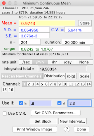
When using the BASIC STATS..., MINIMUM VALUE... and MAXIMUM VALUE... functions, two buttons, labeled 'Use C.V.R.' and 'Set C.V.R. Parameters...' are available. This stands for Cinstant Vplume Respirometry, and itopens a window that lets you set up the variables needed to compute O2 or CO2 exchange in a closed system. In constant volume respirometry (or 'closed system' respirometry), the organism is placed in a sealed chamber, and over time its respiration changes the gas concentrations in the chamber. You measure rates of gas exchange by determining gas concentrations (O2 and/or CO2 ) at the start and end of a period of measurement, and then using the cumulative difference in concentrations and the elapsed time to compute the average rate of change.
The most straightforward way to handle constant volume calculations with LabHelper and LabAnalyst is as follows:
- First, collect a sample or samples of 'initial' (unbreathed) and 'final' gas from the animal chamber(s) and inject them through a gas analyzer while continually recording the concentration (in %) with LabHelper. If you have multiple samples, between injections of sample gas, flush the analyzer with reference gas (or fluid). You should get a data file with a series of 'peaks', one for each injection of 'final' gas (or fluid).
- Next, in LabAnalyst, use the baseline function to set the 'initial' values at zero. The 'final' values now show the % change during the measurement period. These peaks are what you analyze with the C.V.R. option. For each peak, find the maximum deflection from baseline with the MAXUMUM VALUE option, set the C.V.R. parameters, and then switch on Use C.V.R..
Note that this option assumes that the data being
analyzed are in units of % gas concentration and that baseline has already
been corrected. Click the 'Set C.V.R. Parameters...' button and, in the window that opens, specify gas type, chamber volume, elapsed time,
chamber temperature, barometric pressure, initial relative humidity
in the chamber (if the gas contains water vapor), the initial concentrations
of O2 and CO2
(FiO2 and FiCO2),
and the respiratory exchange ratio (RQ). You also need to specify
whether or not CO2 is absorbed prior to
oxygen analysis ('is excurrent CO2 absorbed?' button). When done, click
the 'Store Data and Close' button.
When C.V.R. data... is activated, the results window (example
on the right) shows gas exchange rates in units of ml/min -- but note that
only the mean value is computed as gas
exchange (the SD, SE, etc. are shown in their original units).
To switch off the C.V.R. calculations, click the 'C.V.R.
data...' button. Note that this is a “quick and dirty” CVR estimate; a more versatile CVR calculator is in the SPECIAL menu.
You can avoid using interpolated data in these operations if you select the 'Avoid interpolated data' option in the
ANALYSIS UTILITIES submenu (bottom of the ANALYSIS menu).
back to top

- INTEGRATE BLOCK...
Finds the area under the curve
within the defined block.
There is a choice of time units (seconds, minutes, hours, days, none)
and baseline values. The baseline for integration can be set at zero,
the initial value of the block, the final value of the block,
a user-specified value, or a proportional linear correction
between initial and final block values. Because of the different baseline
options, this operation is considerably more versatile than the integration
feature including in BASIC STATS, MINIMUM, MAXIMUM, and LEVEL.
In this example, the block is integrated using the zero baseline
option with the time unit set as minutes. Note that the start, end,
and proportional options apply to the block defined with the left and
right limit functions.
Keep in mind that you need to pick the time unit that matches the rate
unit used in the channel being analyzed, or the results will not be valid.
If you are using a rate unit for which a matching time unit is not available,
you will need to adjust the results manually. For example,
if your data are in units of Kilojoules/day, you will need to divide the
results by the factorial difference between days and whatever unit you select.
To continue with this example, if you set the units to 'hours' and
your data are in KJ/day, you must divide the results by 24 (since there
are 24 hours per day). Similarly, if you set the units to 'minutes',
you would need to divide by the number of minutes per day (1440).
This can be done conveniently using the 'Store'
and 'Scale' buttons.
 If you select the "∑ plot"
option (button in the bottom row), the computer generates a plot of the
integrated values over time. This plot will change whenever a new
channel, right or left limit, or baseline option is selected. If you select the "∑ plot"
option (button in the bottom row), the computer generates a plot of the
integrated values over time. This plot will change whenever a new
channel, right or left limit, or baseline option is selected.
Additional considerations:
- Use the '+', '-', and 'clear' buttons to add or subtract
successive integral measurements.
- Use the 'limits', 'store', and 'scale' buttons as described
for BASIC STATS.
- This operation prints to a tabular file but the output format isn't 100% compatible since there are no SDs generated during integration.
back to top
LabAnalyst
contains three methods of analyzing the cyclical or waveform
structure of a data set. These are the WAVEFORM, TIME
SERIES, and FFT (fast Fourier transform) operations. All
have different approaches, and the best one to use depends largely on the
data set in question.
- WAVEFORM... ⌘W Uses simple
algorithms to calculate wave frequency and mean peak height. Basically,
the program looks for successive 'peaks' and 'valleys' in
the data. A peak (the 'crest' of a waveform) is defined as a series
of 5 points with the middle point having the highest value, and with values
declining in the two points on either side. The inverse is true for
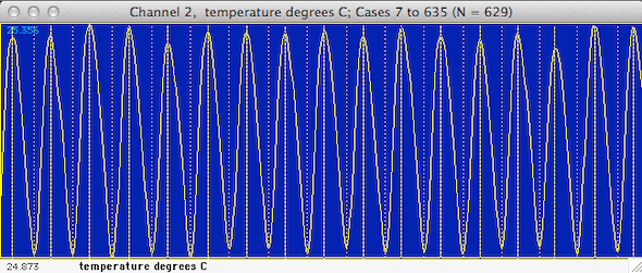
a valley (the 'trough' of a waveform). LabAnalyst marks the peaks and valleys it finds with dotted (valleys)
or dashed (peaks) lines in the block window (see below).
In the default mode the program will use all the data within the block.
Alternately, 'filtering' is possible through cursor selection of minimum
peak and valley values ('triggers') in the block window. Click
the 'use cursor' button and move the cursor to the block window.
A horizontal line will track the cursor's movement and a readout in the
Results window will show the height of the cursor. Click once
to select a peak (done first) or valley trigger. After selection,
peak triggers are shown as pink lines, and valley triggers are green lines.
The post-peak trigger value (default zero) is the number of cases
the program 'skips' after finding a peak. This option can be useful
when analyzing noisy files.

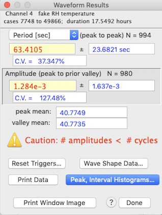
A typical results window is shown at right, above. Note that in
this example the number of periods and amplitudes are not correctly matched (i.e., the number of amplitudes does not equal the
number of cycles +1, indicating that some peaks were not associated with
definable valleys, so the frequency or amplitude may be incorrect).
In that condition, the program beeps and prints a warning, as shown. Warnings are also displayed if no periodicity is found, or if no
amplitudes are found.
The mean values for both peaks and valleys are also shown.
NOTE: The waveform algorithms are easily confused by noise (because
of the way peaks and valleys are defined). If you are only interested
in frequency, it is reasonably safe to reduce noise by smoothing data prior to analysis.
However, smoothing reduces peak amplitudes (in some cases very dramatically),
so it must be used with caution if you need peak height data. Smoothing
is least damaging if peaks are 'rounded' and contain many more points than
the smoothing interval. If necessary, use PAIRS
DIFFERENCE to obtain peak heights, then obtain frequency data after
smoothing.
 The 'wave shape data' button opens a window
with statistical information on the waveform's rise and decay times. The 'wave shape data' button opens a window
with statistical information on the waveform's rise and decay times.
Rise time (the elapsed time from a valley to a subsequent peak) is shown
in blue; decay time (the elapsed time from a peak to a subsequent valley)
is shown in red. The small triangles indicate the means while the
bars show the distributions.
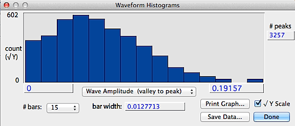
If the data contain more than 10 peaks, additional analyses are available
from the Peak and interval histograms button, which produces histograms
of peak height (shown as the absolute value), wave amplitude
(valley to peak) and interpeak interval (essentially the wavelength
calculated on a peak-to-peak basis), selected with a pop-up menu. Another pop-up menu lets you select the number of bars in the histogram. An example is shown below.
The save data button stores a text file of the histogram values,
the print graph button sends the data to a printer, and the square-root
Y button shows the count as a square-root, which better shows bars with
low counts.
back to top
- Time
series
 This
submenu has two items: This
submenu has two items:
- BASIC TIME SERIES... This
option displays time series data in graphical form. Time series analysis
examines data for many kinds of temporal relationships -- basically, does
sample value at a particular time ( T ) predict sample value at some
later time ( T + z)? A graphical display is useful for determining
if there are periodicities within the data, and (if periodicities exist)
if the waveforms are symmetrical. When this option is selected, LabAnalyst opens a window containing edit
fields for the Start Lag (the initial time increment between samples)
and the Time Step (the time increment added for each successive
plot). Defaults are a start lag of 0 and a time step of 1 sample.
Edit as desired. There are two plotting options:
Use the 'Plot T versus T + step' button to generate 18 scatterplots.
For each, the sample value (X - coordinate) is plotted against the sample
value at a fixed time increment in the future (Y -coordinate):
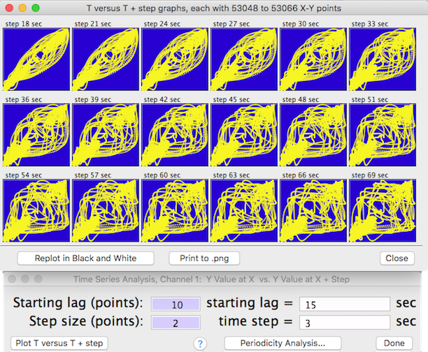
In each plot the time increment is equal to the
start lag plus the sum of the cumulative time steps (i.e., start lag +
time step X plot number). The increment value is shown at the top
of each plot. If there is no temporal predictability, the point distribution
will be random. However, if temporal patterns exist, the distribution
of points will be non-random, and the shape of the distribution will indicate
the degree of symmetry and the scatter will indicate the degree of randomness
or 'noise'. You can replot with different start lags and time step
increments. Click the 'Print to .png' button to make a file copy of the plots. You can replot the window in black and white before saving it to .png.
• Use the 'Periodicity Analysis… ' button to generate a summarized periodicity test for 50, 100, 200, or more stepped time intervals (NOTE: the interval selection buttons are only available if there are sufficient points within the block). For 200 or fewer steps, results are shown as a bar graph; for more steps a line plot is drawn. This is the setup screen for generating a periodicity test:

Output from a typical periodicity test looks like this:

This example shows a 750-step plot. Correlations with negative
slopes are plotted below the zero line. The bar heights are a relative index of how value at time ( T ) predicts value at time ( T + time step). The tallest bar (red on color screens) is the interval with highest predictability. Click the 'Show Other Peaks Where...' button to display only those time correlations with r2 higher than a specified value. Click the 'Copy to PDF' button (or 'Copy to PNG' depending on which text file format was selected in Preferences) to make a copy of the graph. Click the 'Done'
button or the close box to exit.
back to top
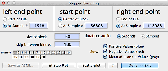
- STEPPED SAMPLING...
This routine computes, plots, and saves sequentially sampled data at user-set
intervals; among other uses, this helps determine the degree to which data
sampled at one time are correlated to data sampled at different times (i.e.,
autocorrelation). For example, if you wanted to compute a relationship
between (say) voluntary running speed and metabolism from a file containing
many different running speeds, you would need to obtain your measurements
at large enough intervals so that there was no autocorrelation between
measurements. The intuitive expectation is that successive measurements
obtained at very short intervals will closely resemble each other, but
eventually become independent as the interval between measurements increases.
The goal would be to use an inter-measurement interval large enough to
be sure that autocorrelation ('pseudoreplication') is minimal.
The iterative sampling process starts at an initial point (a particular
sample) in the file, then steps forwards and backwards by user-defined
intervals (the 'skip' interval) and takes the mean, range, and SD of blocks
of data of user-set duration, symbolized as:
-------||||||||-------|||||||--------|||||||-------||||||||-------
where ----- = skipped samples, ||||| = blocks, and | is the initial point
This process is repeated until user-defined limits are reached, or the
start of end of the data are reached. The initial point can be a user-set
sample number or the central point in a data block (for example, you could
search for the highest point in a data file, use the 'set block'
option, and then use the resulting block as the initial point). If a block
is selected, the start and end points are set to the beginning and ending
points of the block. The default value is 1/2 of the total number of samples.
The control window looks like this:
When ready, click either the "delta-t step plot" button
or select a new channel to display results, as in the following example:

Results are plotted on-screen (blue
for measurements later than the initial point, red
for measurements earlier than the initial point, and gray
for the mean value for both + and - values at a given interval).
The 'scatterplot' button shows an X-Y scatterplot of step-sampled
data from any two of the available channels (it's only available if there
are 2 or more channels in the file).
You can use the channel buttons to select up to 10 channels that can
be analyzed and stored in a tab-delineated (Excel compatable) or .cvs
file with the "save as ASCII" button. Note that you can
select more than 10 channels, but only results from the first 10 will be
stored. If the file contains interpolated data as indicated with the standard
interpolation markers "»" and "«", any
stored values that were computed from interpolated data will be marked
in the Excel file.
back to top
- FFT...
Uses a Fast Fourier Transform (FFT) to calculate
the frequency structure of cyclic data. Theoretically, any waveform
can be decomposed into a set of simple sine waves of different frequencies
and phases. The FFT algorithm finds these fundamental frequencies
and displays them as peaks in the plot area.
 Complex 'summed' frequency data occur frequently in
biology (and in other areas of science). For example, you might want
to use an impedance converter to measure the heart rate in a small mammal or
bird. Unfortunately, in addition to heart rate, you will
also pick up signals produced by breathing movements. Therefore the
instrument output will contain a confusing summation of the combined effects
of breathing and heart rate. It may also contain 'noise' from random
or irregular events (such as muscle movement from minor postural adjustments). Complex 'summed' frequency data occur frequently in
biology (and in other areas of science). For example, you might want
to use an impedance converter to measure the heart rate in a small mammal or
bird. Unfortunately, in addition to heart rate, you will
also pick up signals produced by breathing movements. Therefore the
instrument output will contain a confusing summation of the combined effects
of breathing and heart rate. It may also contain 'noise' from random
or irregular events (such as muscle movement from minor postural adjustments).
Another example might be searching for a circadian 'signal' in long-term environmental data, as in the example above.
Although it is obviously complex, a visual inspection suggests that it does
contain some regularity. However, this periodicity is not readily
studied with either the WAVEFORM or TIME SERIES operations.
Fortunately, the FFT procedure can help find the important underlying components
of this complex wave. In many cases it can detect basic cycles in
a data set even if they are visually 'buried' by random noise.
 The first step in the FFT procedure
is selection of the size of the block of data to be analyzed. The
FFT algorithm requires that the block size be a power of two; depending
on the size of your data set you can select any block size from 128 samples
up to a maximum of 262,144 (256K) samples (in this example, the total number of
samples in the file was about 700; accordingly, the largest possible block
for FFT analysis is 32,568 samples). The first step in the FFT procedure
is selection of the size of the block of data to be analyzed. The
FFT algorithm requires that the block size be a power of two; depending
on the size of your data set you can select any block size from 128 samples
up to a maximum of 262,144 (256K) samples (in this example, the total number of
samples in the file was about 700; accordingly, the largest possible block
for FFT analysis is 32,568 samples).
After you select a block size, the program will
prompt you to go to the plot window and select the block to be
analyzed. Do this by moving the cursor into the plot area, where it
will outline a block of the size you selected.
Fit the cursor block
over the subset of data you wish to analyze and click the mouse once.
This will select the desired FFT block.
Once the block is chosen, click the Do FFT button, and the FFT will be computed and displayed (depending on the block size and the complexity of the waveform, this may take several seconds). Subsequently you can examine the details of the FFT,
select another block size ( ‘∆ interval’ ),
or exit. You may choose whether or not the results are smoothed; they are always shown initially as 'raw' FFT scores.
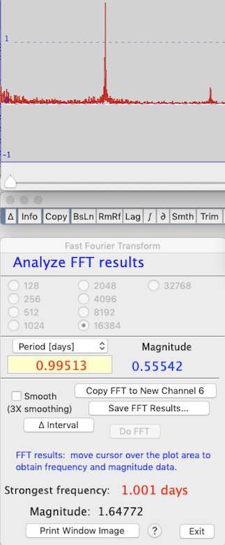
After completing the FFT, the waveform's fundamental frequencies are
shown graphically in the plot area.
An example from the waveform shown in the first image above is shown at right. Note that the complex-appearing waveform can be described as the combination of two (or maybe thre) fundamental frequencies, shown in the plot area as sharp peaks. You can examine the details of
this structure by moving the cursor over the plot; the fundamental frequencies
that have been 'decomposed' from the original signal, and their amplitudes (which are arbitrary but 'proportional' to other peaks and hence are useful for comparing among them),
are shown numerically as peaks in the results window. Another example of the FFT results window is shown below.
In this example, the analysis was performed on 16,384 points, and the strongest (most fundamental) underlying frequency in the waveform was almost exactly one day (this is unsurprising, since the data are of environmental temperature variation over several years). The cursor
is over one of the peaks, which corresponds to a period of 0.995 days and a magnitude
(useful for comparisons among peaks) of 0.55 (magnitude data are displayed
in the plot window data bar). You have a choice of
output units (frequency in Hz, kHz, etc.; period in sec, min, etc.). The software will attempt to use the most reasonable units.
After the transform is complete, you can expand or shrink
the plot window display using the spacebar or return key (similar to the regular 'entire file' versus 'one screenful' display modes modes), or smooth (or unsmooth) the data.
FFT results are stored in channel zero (not normally used by LabAnalyst); use the copy button to
move them to a 'regular' data channel if you want to save them to disk (copying
is only possible if the number of 'regular' channels is <40). Alternately, you can use the 'save FFT…' button to produce an Excel-compatible or .cvs
spreadsheet containing the frequency and magnitude data (saved in whatever frequency or period you selected with the popup menu)
and amplitudes.
Note that if you click the exit button, you are transferred back to the original
data channel. You cannot get back to the FFT results in channel zero except by
re-running the FFT procedure.
back to top
- SLOPE vs TIME...
⌘1 (numeral 1) Calculates rates of change over time within a data
block. Seconds, minutes, hours, or days may be selected as the time
units. Either linear (least squares) or semi-log regression (log Y vs. time) can be selected. The semi-log option is not available if any Y values are negative. When the calculations are complete, a regression line is superimposed on the block window, and the program computes slope, r-squared, and probabilities that slope = 1 or 0. You can check the slope against other values using the 'test' button.
Two values of 'a' (the intercept) are given. One is based on the
time change calculated from the start of the file (t=zero), and the other
is based on the time change within the block, using the assumption that
time zero is the start of the block.

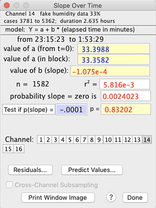
You can use the 'predict values' option to calculate specific Y values as a function of time, or vice versa (this uses the intercept value calculated from the start of the block, not the start of the file). At present, this does not 'back-convert' from log to linear, so if your equation uses log time and log Y, you will need to convert your inputs to their log equivalents, and do the reverse for predicted values.
You can switch channels (for new calculations) with the usual selection
buttons on the bottom of the results window. To change the time units,
re-select the original channel.
You can also test the slope against any user-defined value with the 'test'
button. The 'Residuals…' button draws a plot of the residuals from the regression; results -- time, observed value, predicted value, and residual -- can be saved to an Excel-format text file. - CAUTION: plotting residuals from a large data block (> 10,000 cases) may cause the program to 'beachball' for a long time -- be patient!
Some additional considerations:
- Note that in SLOPE and REGRESSION you cannot send results
to disk or printer by hitting the 'p' key, as usual. Instead, use
the 'print' button (this button only appears if output has been
selected from the FILE menu).
- This option DOES NOT print to a tabular file (the output format is
incompatible).
- REGRESS CHANNELS...
⌘2 This option performs basic regression
analysis for any two channels (obviously, it is only available if the file
has more than one channel):
 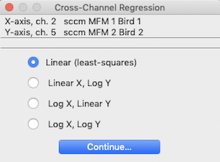
The initial step in the regression procedure is to select the two channels to regress, using the window shown
at left. The program won't let you attempt to regress a channel against
itself, so you may have to do some fancy button-clicking to get your channels
selected.
Next, you need to to chose the type of unit conversions. Linear (least-squares),
semi-log (log Y = a+b*X or Y = a+b*log X), and log-log (log
Y = a + b*log X) regression models are available. However, some of
the conversions will not be available if the data range includes zero or
negative values (since one can't take the log of a negative number)..
 After the 'Continue...' button is clicked, LabAnalyst performs the calculations and produces a scatterplot of the
data points in the block window (x values versus y values), along with the
regression line. After the 'Continue...' button is clicked, LabAnalyst performs the calculations and produces a scatterplot of the
data points in the block window (x values versus y values), along with the
regression line.
• NOTE: regressing large data blocks can be time-consuming. The program will post a warning message when it thinks calculation times will be lengthy.
The numerical results are the same as for the SLOPE vs TIME option
described above -- except that only a single value of the intercept is shown.
You can test the slope against any user-defined value. Enter the slope
into the edit field and click the 'Test if p(slope) =' button (very low probability
values are shown as "<.00001").
The 'Residuals' button will produce a scatterplot of residuals from the regression. 'Select New Channels' lets you set up a new regression of different variables.
 You can use the 'Predict Values' button to use
the regression equation to predict X from a given Y, or vice versa: You can use the 'Predict Values' button to use
the regression equation to predict X from a given Y, or vice versa:
Some additional considerations:
- Note that in SLOPE and REGRESSION you cannot send results
to disk or printer by hitting the 'p' key, as usual. Instead, use
the 'print' button (this button only appears if output has been
selected from the FILE menu).
- This option DOES NOT print to a tabular file (the output format is
incompatible).
- FIND ASYMPTOTE... ⌘3
This is an application of first-order kinetics, in which data approach a
stable plateau (asymptote) according to a rate constant (this means
that the fractional rate of approach to the asymptote is constant
over time). Some examples include heating and cooling (the "Newtonian"
model) and gas mixing and washout characteristics (and many other physical
phenomena).
The program uses an iterative method to find the best-fit asymptote for
a selected block of data, according to the simple model: Y = ln (asymptote
- data). You can chose any number of iterations between 3 and
50 (the default is 6). Using a lot of iterations might increase the accuracy of
the estimate (this doesn't always occur), but will also increase the analysis
time. In practice, you usually don't need to use more than 6 to 10
iterations for good accuracy. Note that if you give it 'messy' data
that do not conform reasonably well to first-order kinetics, the program
may take a long time to produce an estimate (and that estimate may have
fairly glaring errors).


After completing the analysis, LabAnalyst
shows the asymptote, the coefficient of determination or C.D.
(an estimate of the precision of the fit of the data to the model, and hence
the precision of the estimated asymptote), the rate constant (the fraction of the change between a
starting value and the asymptote that is completed during 1 time unit),
and the time to complete a fraction of the total change between a starting
value and the asymptote (values from 1% to 99% are selectable from a pop-up
menu). You can use your choice of time units (seconds, minutes, hours,
or days) for slopes and rate constants.
For relatively small block sizes, LabAnalyst
also draws a goodness-of-fit plot that illustrates how closely the model
matches the data for large blocks you can get this plot by clicking the 'Show Regression' button. CAUTION: for large files (e.g, > 1,000,000 points), plotting is a slow process. As shown above at right, points are plotted as the log (base e) of the
absolute difference between the model predictions and the data:
Y value = ln(abs(asymptote - data))
Individual points are shown only if the total number of points in the
plot is less than 60. In these examples, data are plotted in yellow on a red background and the best-fit regression line predicted by the model is shown in white. You can select other color combinations in the 'Plot Styles' option in the VIEW menu.
After the goodness-of-fit plot is drawn, you can also show the residuals from the regression, as shown below (Caution: this is slower than drawing the regression itself):

Some additional considerations:
- The time needed for finding an asymptote increases with the size of
the data block (as well as the number of iterations). On a typical machine, a block containing several hundred thousand data points will be analyzed within a second or so. For large data blocks, the program will put up a notification that processing may be lengthy. Note that plotting the data takes much longer than analyzing the model fit!
- You cannot send results to disk or printer by hitting the 'p' key,
as usual. Instead, use the 'print' button (this button
is available only if output has been selected from the FILE
menu).
- This option DOES NOT print to a tabular file (the output format is
incompatible).
back to top
- FIT POLYNOMIAL... ⌘4 In some cases,
relationships between different variables are best expressed with a polynomial
regression. LabAnalyst lets
you fit pairs of channels with polynomials of up to 9 degrees. The
model is:
Channel Y = (polynomial expression of Channel X).
After you select the X and Y channels (as described above for linear regression), the program
computes and displays either a default polynomial of 3 degrees, or (if the Polynomial option has been run since program launch) the last polynomial degree used. Regression statistics (mean and SD of X and Y, residual Y variance, and r2) as well as the polynomial coefficients are shown. You can then
select other degrees using the pop-up menu. In this example, a 5-degree
polynomial was used to predict the temperature of a small sunlit sphere
from shade air temperature; the resulting equation -- shown at the right
of the window -- explains about 69% of the variance in sphere temperature.

Note: In some conditions (particularly if you are computing a high-degree
polynomial when the magnitudes of the X and Y channels are large or differ greatly), it is possible to exceed the numeric limits of the program. Results are unpredictable when theis happens, but usually
the value of r2 is set to zero or is lower than with a lower degree polynomial, and some or all of the coefficients will have extremely large or small values.
After completing the analysis, several options are available. The
'Pick New Channels' button lets you change the X and Y variables.
The 'Make New Chan From Polynomial' button (only available if the
number of channels is less than 40) generates a new channel by applying
the current polynomial equation to the data in the X channel -- in other
words, it computes and saves a new Y value for every sample in the X channel.
 The 'Show All r^2' button helps you select
the most appropriate degree for the polynomial equation. The predictive
value of a polynomial always increases as the degree increases.
However, the increase in accuracy usually plateaus, so it is reasonable
to use the simplest equation consistent with good predictive power.
When the 'Show All r^2' button is clicked, the program computes the
r2 value for all degrees between 1 and 9, and then shows a bar
graph of the results. [You can remove this plot by clicking the highlighted
'Ahow All r^2' button.] The 'Show All r^2' button helps you select
the most appropriate degree for the polynomial equation. The predictive
value of a polynomial always increases as the degree increases.
However, the increase in accuracy usually plateaus, so it is reasonable
to use the simplest equation consistent with good predictive power.
When the 'Show All r^2' button is clicked, the program computes the
r2 value for all degrees between 1 and 9, and then shows a bar
graph of the results. [You can remove this plot by clicking the highlighted
'Ahow All r^2' button.]
In the example shown at right, there was little change in predictive
power until the degree of the polynomial exceeded 3, and then little additional
change until the degree reached 8 and 9 (you can select the color of bar
graph plots in the Plot Style option in the VIEW menu.)
Additional considerations:
Additional considerations:
- As with any regression method, interpolation is 'safer' than extrapolation in terms of predictive accuracy.
- You cannot send results to disk by hitting the 'p' key,
as usual. Instead, use the 'Print' button (this button
is available only if output has been selected from the FILE
menu).
- This option DOES NOT print to a tabular file (the output format is
incompatible).
back to top
- TIME INTEGRATION
⌘7 This operation calculates the cumulative
duration of data in the selected block that satisfy two Boolean criteria:
greater than one user-selected value, and/or less than a second user-selected
value.
An example time integration window is shown at right. The default
minimum and maximum values are the lower and upper limits (respectively)
of the data range in the block, which includes 100% of the data and results
in a single event in each category. You can set new limits (as shown
here) in three ways:
- When the 'minimum' or 'maximum' buttons are clicked,
the limits are reset to these values
- When the 'greater than' or 'less than' buttons are clicked,
you can use the mouse to move cursor in the block window to graphically
select the upper and lower limits.
- Finally, you can directly type in the limit values in the edit fields
(hitting "return" will force the program to recalculate the results).
Be sure to select the time unit you want. Clicking the 'Switch to Selective integration' button changes to that mode, using the current set points.
- You cannot send results to disk or printer by hitting the 'p' key,
as usual. Instead, use the 'print' button (this button
only appears if output has been selected from the FILE
menu).
- This option DOES NOT print to a tabular file (the output format is
incompatible).
- EVENT COUNTING
⌘8 This operation counts the number of 'events'
in the selected block that satisfy two Boolean criteria: greater than
one user-selected value, and less than a second user-selected value.
An 'event' occurs when the data cross one of the two Boolean 'boundaries'.
A 'negative' event is counted when the data drop below the lower
limit, and a 'positive' event is counted when the data rise above
the upper limit. The default minimum
and maximum values are the mean of the lower and upper limits of the
data range in the block, which includes 100% of the data and results in
a single event in each category. An example of event counting is shown below.

You can set new limits in three ways:
- When the 'minimum' or 'maximum' buttons are clicked,
the limits are reset to these values
- When the 'greater than' or 'less than' buttons are clicked,
you can use the mouse to move cursor in the block window to graphically
select the upper and lower limits.
- Finally, you can directly type in the limit values in the edit fields
(hitting "return" will force the program to recalculate the results).
- You can include all the events, or elect to analyze only events longer than a minimum duration. Toggle these options with the 'count all events' button.
The right side of the window shows basic statistics for the durations of positive and negative events (mean, SD, range), and a histogram of these values. Only complete events (including both beginnings and endings) are shown here. You can elect to analyze only events longer than a minimum duration. The 'show all events' button forces the basic event counters to show all events, not just those longer than the minimum duration.
The 'save details' button makes a text file (Excel format) containing the polarity (positive or negative), start time, duration, and basic statistics (mean, SD, minimum, maximum) for each identified event. Some additional considerations include:
- You cannot send results to disk or printer by hitting the 'p' key,
as usual. Instead, use the 'print' button (this button
only appears if output has been selected from the FILE
menu).
- This option DOES NOT print to a tabular file (the output format is
incompatible).

- SELECTIVE INTEGRATION
This operation integrates all data in
the selected block that satisfy two Boolean criteria: greater than one user-selected
value, and less than a second user-selected value. The window shows
the integrated value in absolute terms and as the fraction of the total
integrated block.
An example of selective integration is shown at right. The default
minimum and maximum values are the lower and upper limits (respectively)
of the data range in the block, which includes 100% of the data and results
in a single event in each category. You can set new limits (as shown
here) in three ways:
- When the 'minimum' or 'maximum' buttons are clicked,
the limits are reset to these values
- When the 'greater than' or 'less than' buttons are clicked,
you can use the mouse to move cursor in the block window to graphically
select the upper and lower limits.
- Finally, you can directly type in the limit values in the edit fields
(hitting "return" will force the program to recalculate the results).
- Some additional considerations include:
- You cannot send results to disk or printer by hitting the 'p' key,
as usual. Instead, use the 'print' button (this button
only appears if output has been selected from the FILE
menu).
- This option DOES NOT print to a tabular file (the output format is
incompatible).
Additional considerations for TIME and SELECTIVE INTEGRATION and EVENT COUNTING:
- The 'distribution' button produces a histogram (bar graph) of frequency distribution in a small moveable window. If the file has more than one channel, you can click on buttons for different channels and get those means (you can also use the keyboard to select channels). With an option in the PREFERENCES menu, you can have different histogram windows for each channel, or use the same small window for all channels.
- You cannot send results to disk or printer by hitting the 'p' key, as usual. Instead, use the 'print' button (this button only appears if output has been selected from the Output Menu).
• CROSS-CHANNEL SUBSET SELECTION... This window lets you perform some analysis function (average, integrate, etc.) on a subset of the data, based on the values in one or more other channels. As in the example below, you could calculate the average oxygen consumption (iVO2) in channel 1 only when:
- (a) running speed (channel 4) is greater than 12 meters/min and
- (b) iVO2 is less than 5.4 and
- (c) oxygen deflection (channel 2) is greater than 0.1% and less than 0.75%, as shown below.

Even greater specificity is possible (e.g., if temperature was recorded you could limit analysis to samples when temperature is less than 20 °C).
Choose your selection criteria according to three Boolean criteria: channel values greater than, less than, or equal to, a user-set index. Click the appropriate button(s) in the channel(s) of your choice, and enter your selection indices.
- You can use multiple selection criteria in a single channel, as long as they aren't mutually exclusive (for example, using within-channel criteria of 'greater than 50 and less than 40' will eliminate all possible values). You can also use multiple criteria in different channels.
- Analysis operations that permit cross-channel subset selection show a check button (at the bottom of the analysis window) for activation and deactivation of this feature.
- Edit fields that contain no visible numeric values are assumed to contain a value of zero.
- NOTE: To finalize your selection, you must click the 'set index' button. When you do this, all of the data in the window are recorded, but only values with checked buttons will be used.
back to top
- Analysis utilities This
submenu has four items:
- AUTOREPEAT ⌘R Toggles the auto-repetition feature
for analysis modes. When active, autorepeat mode repeats the last
analysis used whenever a new block is selected. If you want to do
something different, just pick the new analysis from the menu or from the
buttons below the plot area.

- BLOCK WIDTH...
Allows automatic selection of
blocks of user-defined duration with a single mouse click, instead of the
normal method of clicking on both the start and end of the desired block (or clicking and dragging).
In this mode, the cursor is contained within a box that 'frames' the block
duration in the plot area. Position the cursor over the desired block
and click once to select it.
The default automatic block size is equivalent to 13 samples or 12 sample
intervals (e.g., 60 seconds with a 5-second sample interval). Any
other block size can be selected, as long as it contains more than 2 samples
and less than 1/4 of the file duration. In this example, a 5-minute block duration (300 seconds) has been selected.
Return to the standard two-click selection method with the 'Normal
block selection' button.
- SCALE RESULTS... Opens
a window for entry of scaling factors that can be selectively applied to
the results of several analysis operations with the 'scale' button
(in the RESULTS window). These factors take the form:
final value = (result x B) +A or final value = (result ÷
B) +A
 Different A and B values can be
applied to each channel, but you must enter the correct values in any channel
you wish to scale (in other words, if you have scaling factors entered
for channel 5, they apply only to channel 5 unless they are also
entered in another channel of interest). Different A and B values can be
applied to each channel, but you must enter the correct values in any channel
you wish to scale (in other words, if you have scaling factors entered
for channel 5, they apply only to channel 5 unless they are also
entered in another channel of interest).
This example shows:
- addition of .74 to channel 1
- multiplication of channel 3 by 0.140479, and addition of .002 to the
result.
- division of channel 5 by 2.
- no change to the other channels.
- The 'Store' button in many
of the analysis mode windows allows you to directly transfer the current
results mean for use as a scaling factor. When you click the Store
button, the scaling factors window appears. Click on any channel's
"*" or "÷" button, and the current mean will
appear in the first edit field (the multiplication or division factor)
for that channel.
- DON'T USE INTERPOLATED DATA
If this option is selected, the AVERAGE,
MINIMUM VALUE, MAXIMUM VALUE, MOST LEVEL, MOST
VARIABLE, SLOPE OVER TIME, and REGRESSION operations will
not use interpolated data when scanning for desired values. Note that it
does not matter which channel was interpolated: if this option is
selected all data from any channel within interpolation boundaries
will be rejected. Note that interpolation is determined from the standard
interpolation markers: "»" indicates the start of interpolation
and "«" indicates the end of interpolation. These are optionally
set automatically in the Remove references and Interactive spike
removal operations, or you can insert them manually from the 'markers'
submenu in the VIEW menu.
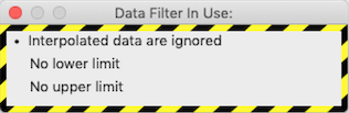 If you have selected this option and an
analysis operation encounters interpolated data within the regions selected
for analysis, this warning window is shown: If you have selected this option and an
analysis operation encounters interpolated data within the regions selected
for analysis, this warning window is shown:
You will also notice that the number of cases shown in the 'Results'
window is less than shown in the 'Block' window. The difference is the
number of interpolated data points that were ignored during analysis.
- BLOCK SHIFT LEFT << ⌘< If there is room in the plot area, this will shift the block to the left (i.e., towards earlier events) by one blockwidth of data points.
- BLOCK SHIFT RIGHT >> ⌘> If there is room in the plot area, this will shift the block to the right (i.e., towards later events) by one blockwidth of data points.
- BLOCK SHIFT RULES This opens a small window that lets you select how the shift block operations work: with or without overlap of one case. For example, if your block contains cases 200-400 and you shift it right with overlap, the new block will contain cases 400-600. If you use the default non-overlap option, the new block will contain cases 401-601.
back to top
| |
