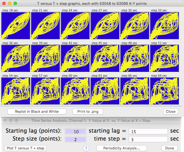
In each plot the time increment is equal to the
start lag plus the sum of the cumulative time steps (i.e., start lag +
time step X plot number). The increment value is shown at the top
of each plot. If there is no temporal predictability, the point distribution
will be random. However, if temporal patterns exist, the distribution
of points will be non-random, and the shape of the distribution will indicate
the degree of symmetry and the scatter will indicate the degree of randomness
or 'noise'. You can replot with different start lags and time step
increments. Click the 'Print to .png' button to make a file copy of the plots. You can replot the window in black and white before saving it to .png.
• Use the 'Periodicity Analysis… ' button to generate a summarized periodicity test for 50, 100, 200, or more stepped time intervals (NOTE: the interval selection buttons are only available if there are sufficient points within the block). For 200 or fewer steps, results are shown as a bar graph; for more steps a line plot is drawn. This is the setup screen for generating a periodicity test:

Output from a typical periodicity test looks like this:

This example shows a 750-step plot. Correlations with negative
slopes are plotted below the zero line. The bar heights are a relative index of how value at time ( T ) predicts value at time ( T + time step). The tallest bar (red on color screens) is the interval with highest predictability. Click the 'Show Other Peaks Where...' button to display only those time correlations with r2 higher than a specified value. Click the 'Copy to PDF' button (or 'Copy to PNG' depending on which text file format was selected in Preferences) to make a copy of the graph. Click the 'Done'
button or the close box to exit.